Reading the Charts for Beginners
-
 By FXT
 - July 13, 2023
- FXT Analysis
This guide will show traders (and even new traders) how to read charts and find trades to execute that have a great risk reward.
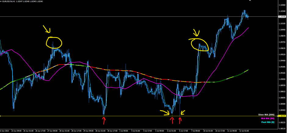
Support and Resistance
When pricing is seen to reject off a price level over and over, it can be considered a support or resistance level. Both levels basically mean the same thing, but support is when price is supported upwards (and stopped from declining further), while resistance is when price is stopped from gaining higher ground.
The image shows a resistance point in the yellow circles, where the circle to the right may offer an opportunity to get short (sell) from the similar price level on the first time it touches that price level again. As the market is quite bullish, there wasn’t too much profit to be made there.
On the other hand, the red arrows down the bottom of the image show areas of support. There is a slight push lower on 2 occasions after the initial support price area, however the risk reward on these trades could have been excellent.
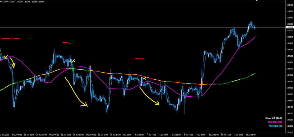
Using Indicators for Simple Entries and Exits
Another way to get into trades is by using simple indicators to determine reasonable entry points into the market. The chart below shows a purple line which is the MA 50 (moving average on 50 period setting, on a EURUSD 1 Hour Chart).
The Strategy: mentioned here is looking for price activity (whole candles) trading above the purple line, then enter a trade once a candle’s high price is lower than the purple line (the entire candle is now below the purple line). This example shows 3 trade setups with good risk reward ratios (distance between the red line or potential stop loss price, vs distance to the potential target price).
The Challenge: Can you identify what trades would be taken for the same strategy only for buy trades instead? So, when the pricing is trading below the purple moving average, then afterwards a candle’s low trades above the purple line. This would be the entry point.
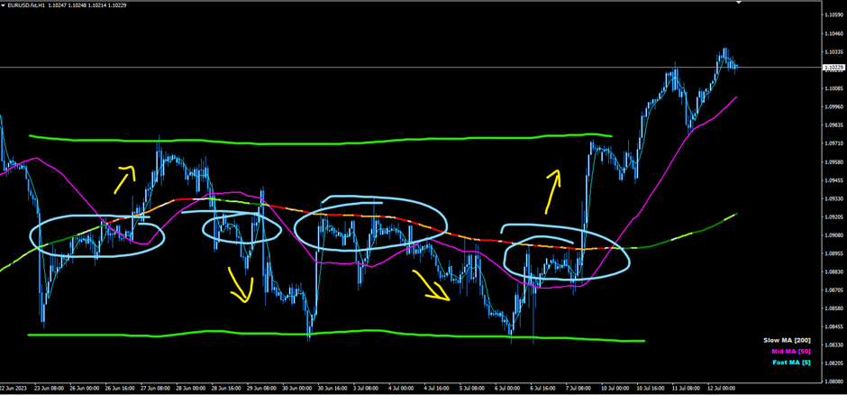
Reading Price History
Price history paints a picture of a range of information that can be used to make trading decisions. The chart below shows a bit of information which will be further detailed in a couple of sections.
Firstly, the blue circles show areas of pricing where the market seems to be happy to trade. The market seems to be in balance as those areas hold the prices in that area for a decent amount of time compared to some of the more erratic pricing areas.
When pricing breaks out of these areas, the market can become imbalanced and has less tread to work with and hold it in position. This allows the market to move more sharply in one direction. This is how breakouts can occur. The yellow arrows indicate areas where trades may be considered following a break of the balanced pricing areas, and a breakout may happen. The green parallel lines also indicate a channel, which is a range in which price is trading within. The channel is similar to the ‘balanced pricing’ however it is more spread out and offers potential trading within its range, while the balanced prices are grouped tightly together.
Candlestick Patterns
There are many candlestick patterns that can be read, the above chart shows a channel (also considered a pattern), but another favourite is a double top or double bottom, which is a fairly similar concept to support and resistance. It uses a previous high that is clear of other recent pricing history, and a trader waits for this high price to be hit once more before selling the market. The buy side is the same only for the lowest low, where the trader waits for the low to be hit once more before buying it.
The chart below shows a few times where this concept has plaid out. The yellow shows a possible double bottom, followed by a potential buy, and the same happens as per the orange circles. A double top is shown in the green circles where a trader could have shorted the market.

Final Trading Thoughts
The above concepts are a great way to find trade setups and create areas where you may want to enter the market. Being patient and waiting for those pricing areas to be hit can give traders a serious edge. This article expressed about 13 potential entries from the one chart, each with the opportunity for profit.
Your entry is a critical part of trading, and a perfect entry reduces your risk significantly.
Related Posts

Part 2: Evolution of a Trader - Where are You, Currently?
- By FXT
- October 20, 2021


